Line, bar and candlestick charts
Every price chart shows price on the vertical axis and time on the horizontal axis. What changes between chart types is how each period is drawn. SPM Trader offers four chart types: candles, bars, line and Heikin Ashi. You will use candles most of the time, but each type is useful to know.
A line chart connects the closing price of each period with one line. It hides the highs and lows, so it is the cleanest view of direction. Use it to see the big picture, for example a year of daily closes, or to spot a level where many closes have turned.
A bar chart, also called an OHLC chart, draws each period as a vertical bar from the high to the low. A small tick on the left marks the open and a tick on the right marks the close. It shows the same four prices as a candle but is harder to read at a glance.
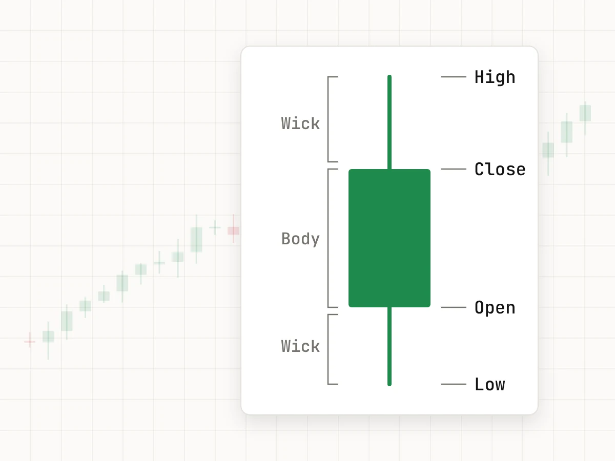
A candlestick chart shows the open, high, low and close as a colored body with thin wicks. The color tells you at once whether the period closed up or down, and the shape shows how far price traveled and where it settled. That is why most traders use candles, and why the rest of this course does too.
Heikin Ashi candles are a smoothed version of normal candles. Each Heikin Ashi close is the average of the period’s open, high, low and close, and each open is the midpoint of the previous Heikin Ashi candle’s body. Trends show up as long runs of same-colored candles, which some traders find calmer to read. The catch is that the prices on a Heikin Ashi chart are not the real traded prices, so do not use them to set exact entries or stops.
Say EUR/USD opens a one-hour period at 1.08452, trades up to 1.08610, down to 1.08390, and closes at 1.08575. A line chart shows only the close, 1.08575. A bar or a candle shows all four prices. The range of the hour is 1.08610 − 1.08390 = 0.00220, or 22 pips, and the close is 1.08575 − 1.08452 = 0.00123, or 12.3 pips, above the open.
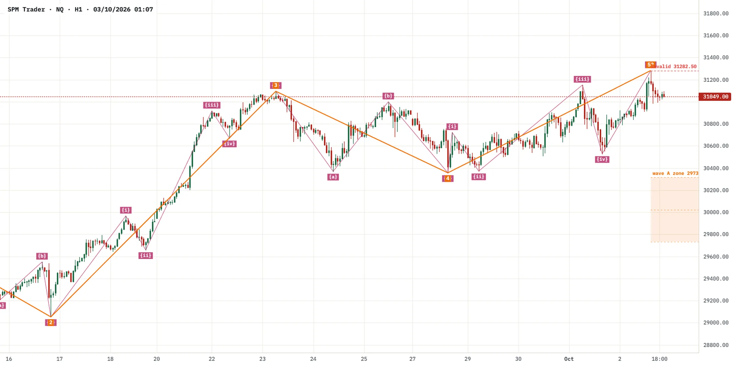
Open one market and switch the same chart between line, bars and candles for a minute. Seeing the same prices drawn three ways is the quickest way to learn what each type leaves out.
Anatomy of a candlestick
Each candle covers one period of the chart’s timeframe, for example one hour on an H1 chart. It records four prices: the open, the first price of the period; the high and the low, the extremes reached; and the close, the last price of the period.
The body is the box between the open and the close. If the close is above the open, the candle is bullish and is usually drawn green or white. If the close is below the open, it is bearish and usually drawn red or black. Colors can be changed in most platforms, so check your settings before you read anything into them.
The wicks, also called shadows, are the thin lines above and below the body. The upper wick reaches the high and the lower wick reaches the low. They show prices that traded during the period but were not held at the close.
- Large body, small wicks: one side was in control for most of the period.
- Small body, long wicks on both sides: indecision, neither side won.
- Long lower wick, small body near the top: sellers pushed price down and buyers brought it back. Often called a hammer or pin bar.
- Long upper wick, small body near the bottom: buyers pushed price up and sellers brought it back. Often called a shooting star.
A long wick is a sign of rejection. A long upper wick at a resistance level suggests that buyers tried to go higher and failed, and that sellers are active there. A long lower wick at support suggests the opposite. The same wick in the middle of nowhere says much less.
A one-hour gold candle opens at 2,350.00, rises to 2,362.00, falls to 2,348.00 and closes at 2,352.00. The body is 2,352.00 − 2,350.00 = 2.00. The upper wick is 2,362.00 − 2,352.00 = 10.00 and the lower wick is 2,350.00 − 2,348.00 = 2.00. The full range is 2,362.00 − 2,348.00 = 14.00, so the upper wick is 10.00 ÷ 14.00 ≈ 71% of the range. Buyers reached 2,362.00 but could not hold it.
A single candle is one small piece of evidence, not a signal. The same shape can lead to a reversal or to nothing at all. Read every candle together with where it formed and what the candles before it did.
Before you judge a candle, answer two questions: is it at a level that matters, and what did the last five to ten candles do? If you cannot answer both, the candle’s shape should not change your view.
Timeframes and top-down analysis
The timeframe sets how much time each candle covers. M15 means 15 minutes per candle, H1 one hour, H4 four hours, D1 one day, W1 one week and MN one month. SPM Trader has nine timeframes, from M1 up to MN.
The same market can rise on the daily chart while it falls on the hourly chart. Neither view is wrong. They describe different time horizons. Trouble starts when you trade one timeframe and ignore what the larger one is doing, for example buying a small bounce on M15 straight into a falling daily trend.
Top-down analysis fixes this. You start on a higher timeframe to find the direction and the main levels, then step down to a lower timeframe to plan the entry. A common pairing is D1 for direction and H1 for entries. Some traders add H4 in between to see the structure more clearly.
- On D1, decide the direction: higher highs and higher lows, lower highs and lower lows, or a sideways range.
- Mark the nearest major support and resistance zones on D1.
- Switch to H1. Look only for trades in the D1 direction, near the zones you marked.
- Plan the entry, stop and target on H1, then check that they still make sense on D1.
Lower timeframes are not easier. They have more candles, more false breaks and more noise, and trading costs take a bigger share of each move. Higher timeframes give fewer trades but larger moves, and they need wider stops and therefore smaller position sizes for the same dollar risk.
Say the spread on EUR/USD is 1 pip in this example. If you aim for 10-pip moves on M5, the spread costs 1 ÷ 10 = 10% of your target before the trade starts. If you aim for 60-pip moves on H1, it costs 1 ÷ 60, which is under 2%.
Choose your timeframes to fit your day. If you can check the chart only in the morning and evening, H4 and D1 suit you better than M5, which needs constant attention.
Write down your fixed set of timeframes, for example D1 and H1, and stick to it. Flipping through timeframes until one agrees with the trade you want is a common way to talk yourself into a poor entry.
Trends and market structure
Market structure is the pattern of swing highs and swing lows on your chart. A swing high is a peak with lower highs on both sides. A swing low is a trough with higher lows on both sides. Once you mark the last few swings, the state of the market is usually clear.
- Uptrend: higher highs and higher lows. Each pullback stops above the previous low.
- Downtrend: lower highs and lower lows. Each bounce stops below the previous high.
- Range: highs and lows at roughly the same levels. Price moves between a ceiling and a floor.
EUR/USD on H4 makes a low at 1.08000, rises to 1.08600, pulls back to 1.08250, then rises to 1.08900. The new high, 1.08900, is above the old high, 1.08600, and the pullback low, 1.08250, is above the old low, 1.08000. That is a higher high and a higher low, so the structure is up. The pullback was 1.08600 − 1.08250 = 0.00350, or 35 pips. If price later closes below 1.08250, the last higher low, the uptrend structure is broken. That does not prove a downtrend has started, only that the up structure no longer holds.
Structure tells you which side to favor. In an uptrend, look for buys after pullbacks toward the last higher low or a support zone, not after price has already run far from it. In a downtrend, do the reverse. In a range, buying near the floor and selling near the ceiling can work until the range breaks, and the middle of a range is usually the worst place to enter.
Trends end, and the warning signs are often visible. A new high that barely clears the old one, a pullback that is deeper than the previous ones, and finally a close below the last higher low all show buyers losing control. SPM Trader’s premium Smart Money tools can label breaks of structure (BOS) and changes of character (CHoCH) for you. Treat those labels as an aid to your own reading, not as trading signals.
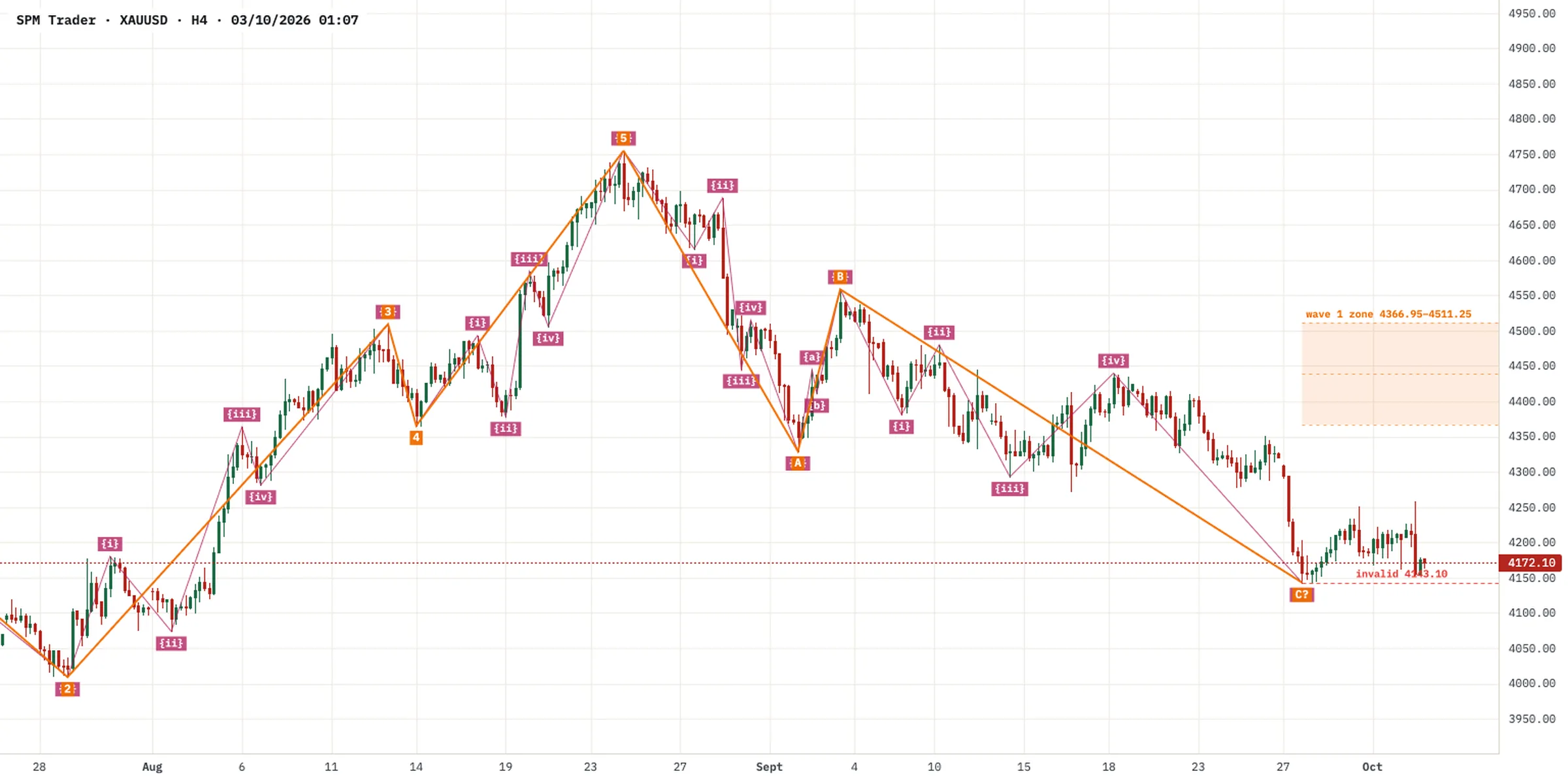
Before each session, write one word for each market you follow on your main timeframe: up, down or range. If you cannot decide within a minute, treat it as a range or as unclear, and wait.
Support and resistance
Support is a price area where falling prices have stopped and turned up before. Resistance is an area where rising prices have stopped and turned down. These areas matter because many traders watch them and place orders there, so price often reacts when it returns.
Draw them as zones, not lines. Price rarely turns at exactly the same tick twice. Draw a band that covers the turning points, using bodies and wicks. On EUR/USD H1 a zone might be 8 to 15 pips tall, on D1 it can be much wider. If price pokes a few pips through your line and comes back, a zone would have shown you that this was normal.
Role reversal is one of the most useful ideas on a chart. When price breaks clearly through resistance and holds above it, that zone often acts as support on a later pullback. Broken support often turns into resistance in the same way.
Say gold turned lower three times between 2,395.00 and 2,402.00, so you mark a resistance zone 7.00 tall. Later a daily candle closes at 2,415.00, above the zone. Over the next days price pulls back to 2,399.00, inside the old zone, and turns up again. The old resistance has acted as support. A buy at that retest with a stop below the zone, for example at 2,390.00, would risk 2,399.00 − 2,390.00 = 9.00. If price instead closes back below 2,395.00, the break has failed and the idea is wrong.
Not every level deserves the same weight. Judge each one before you rely on it:
- Reactions: two or three clean turns count for more than one.
- Strength: a sharp move away from a level shows more interest than a slow drift.
- Timeframe: a zone visible on D1 usually matters more than one visible only on M5.
- Role reversal: a level that has worked as both support and resistance is often well watched.
- Round numbers: prices such as 1.10000 or 2,400.00 often attract orders.
Levels also give you logical places for stops and targets, which the stop loss and take profit guide covers in detail.
Mark no more than two or three zones above and below the current price on your main timeframe, then set a price alert at the edge of each. SPM Trader sends alerts by email and sound, so you do not need to watch the chart all day.
Indicators as helpers
Indicators are calculations based on price, and sometimes volume. They do not see anything the chart does not already show. They summarize it. Use them to support what you read from price, not to replace it. SPM Trader has more than 130 indicators, far more than any one trader needs.
A moving average is the average closing price of the last N candles, updated with each new candle. A simple moving average (SMA) weights every candle equally. An exponential moving average (EMA) gives more weight to recent candles, so it reacts faster. Traders use moving averages to judge direction, for example price above a rising 50-period average, and as a rough area where pullbacks may slow.
A 5-period SMA on EUR/USD uses the last five closes: 1.08420, 1.08460, 1.08510, 1.08480 and 1.08530. Their sum is 5.42400, and 5.42400 ÷ 5 = 1.08480. With each new candle, the oldest close drops out. Built only from past closes, every moving average lags price.
The Relative Strength Index (RSI) measures momentum on a scale from 0 to 100, usually over 14 periods, by comparing the size of recent up moves with recent down moves. Readings above 70 are often called overbought and below 30 oversold. In a strong trend, RSI can stay above 70 for a long time, so overbought on its own is not a reason to sell. It is more useful for spotting divergence: price makes a higher high while RSI makes a lower high, a sign that momentum is fading.
Fewer indicators usually work better. Many are built from the same prices and say the same thing. RSI, Stochastic and CCI are all momentum oscillators, so three of them agreeing is one piece of evidence counted three times. More indicators also mean more conflicting readings, which leads to hesitation or to picking whichever one agrees with you.
- Use two or three indicators at most, each with a different job, for example one for trend and one for momentum.
- Keep standard settings unless you have tested a change. Endless tweaking fits the past, not the future.
- Write down in your trading plan exactly what each indicator must show before you take a trade.
- Remove any indicator you have not used in a real decision for a week.
Indicators are analysis tools, not trading signals. A crossover or an RSI reading does not tell you that a trade will win. To practice reading charts without risk, open a free demo account.
Try a clean chart for one week: candles, your support and resistance zones, one moving average and RSI. If you do not miss anything, keep it that way.
Key takeaways
- Candles show the open, high, low and close; long wicks show prices that were rejected.
- Use a higher timeframe for direction and a lower one for entries, and keep a fixed set.
- Higher highs and higher lows mean up, lower highs and lower lows mean down, anything else is a range.
- Draw support and resistance as zones and judge them by reactions, timeframe and role reversal.
- Use two or three indicators with different jobs as helpers to price, never as signals.
This lesson is general education, not investment advice. Examples use illustrative numbers. CFDs are complex instruments and come with a high risk of losing money rapidly due to leverage.